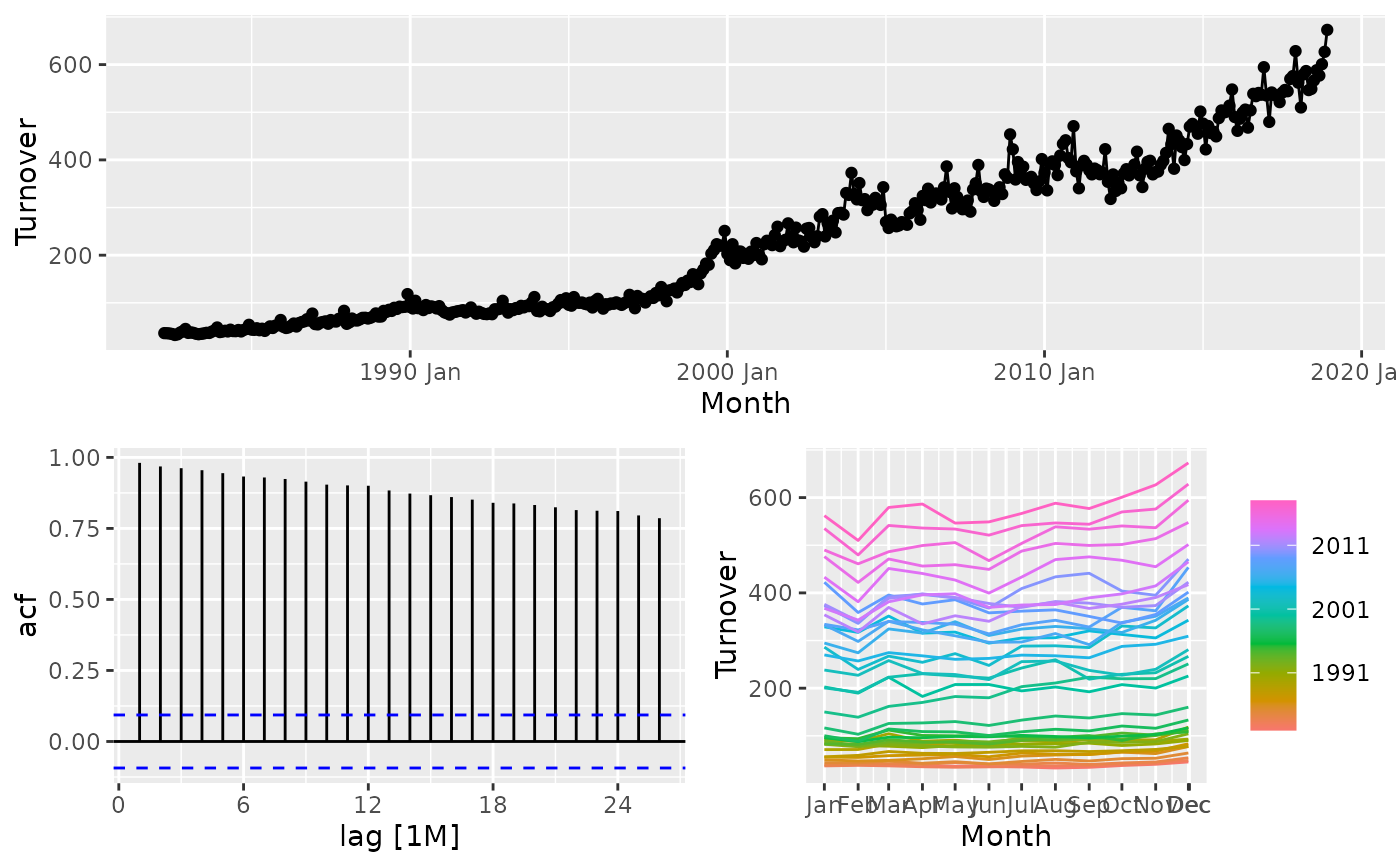
gg_tsdisplay(
  data,
  y = NULL,
  plot_type = c("auto", "partial", "season", "histogram", "scatter", "spectrum"),
  lag_max = NULL
)
Arguments
- data
A tidy time series object (tsibble)
- y
The variable to plot (a bare expression). If NULL, it will automatically selected from the data.
- plot_type
type of plot to include in lower right corner. By default (
"auto") a season plot will be shown for seasonal data, a spectrum plot will be shown for non-seasonal data without missing values, and a PACF will be shown otherwise.- lag_max
maximum lag at which to calculate the acf. Default is 10*log10(N/m) where N is the number of observations and m the number of series. Will be automatically limited to one less than the number of observations in the series.
Value
A list of ggplot objects showing useful plots of a time series.
Details
gg_tsdisplay() was soft deprecated in feasts 0.4.2. Please use ggtime::gg_tsdisplay() instead.
Plots a time series along with its ACF along with an customisable third graphic of either a PACF, histogram, lagged scatterplot or spectral density.
References
Hyndman and Athanasopoulos (2019) Forecasting: principles and practice, 3rd edition, OTexts: Melbourne, Australia. https://OTexts.com/fpp3/
