![[Deprecated]](figures/lifecycle-deprecated.svg)
gg_lag(
  data,
  y = NULL,
  period = NULL,
  lags = 1:9,
  geom = c("path", "point"),
  arrow = FALSE,
  ...
)
Arguments
- data
A tidy time series object (tsibble)
- y
The variable to plot (a bare expression). If NULL, it will automatically selected from the data.
- period
The seasonal period to display. If NULL (default), the largest frequency in the data is used. If numeric, it represents the frequency times the interval between observations. If a string (e.g., "1y" for 1 year, "3m" for 3 months, "1d" for 1 day, "1h" for 1 hour, "1min" for 1 minute, "1s" for 1 second), it's converted to a Period class object from the lubridate package. Note that the data must have at least one observation per seasonal period, and the period cannot be smaller than the observation interval.
- lags
A vector of lags to display as facets.
- geom
The geometry used to display the data.
- arrow
Arrow specification to show the direction in the lag path. If TRUE, an appropriate default arrow will be used. Alternatively, a user controllable arrow created with
grid::arrow()can be used.- ...
Additional arguments passed to the geom.
Value
A ggplot object showing a lag plot of a time series.
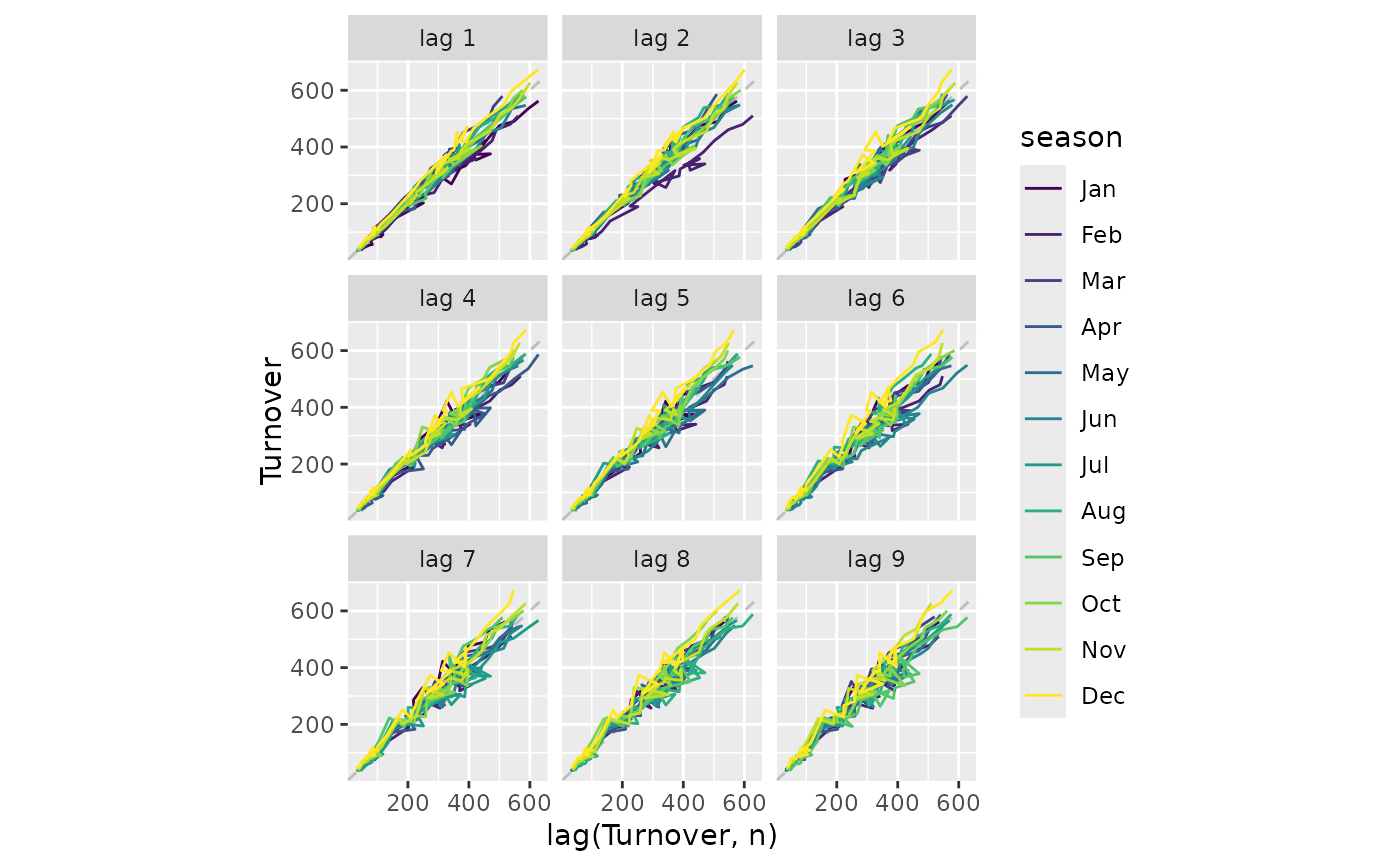
Details
gg_lag() was soft deprecated in feasts 0.4.2. Please use ggtime::gg_lag() instead.
A lag plot shows the time series against lags of itself. It is often coloured the seasonal period to identify how each season correlates with others.